This project focuses on creating a strong brand identity and content strategy for a client, specifically a minor program called Health Innovation. The goal was to make the minor more visible, attract more students, and create a consistent look that shows the main values of the minor: innovation, teamwork, personal growth, being ready for the future, and having fun.
The assignment required developing several deliverables, including:
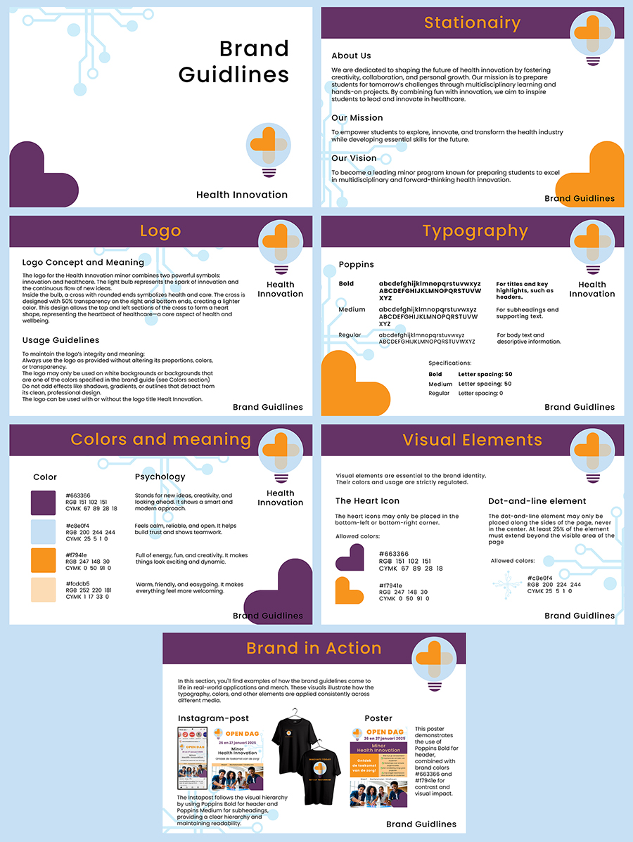
• A brand guide that visually represents the minor.
• A content strategy with marketing materials such as a promotional video, posters, and social media posts.
• A timeline for implementing the strategy to maintain consistent communication.
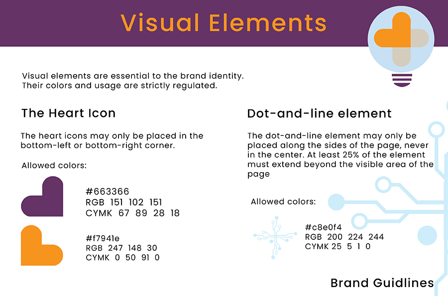
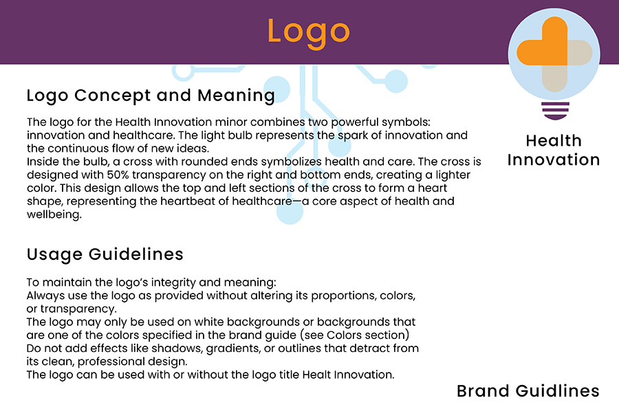
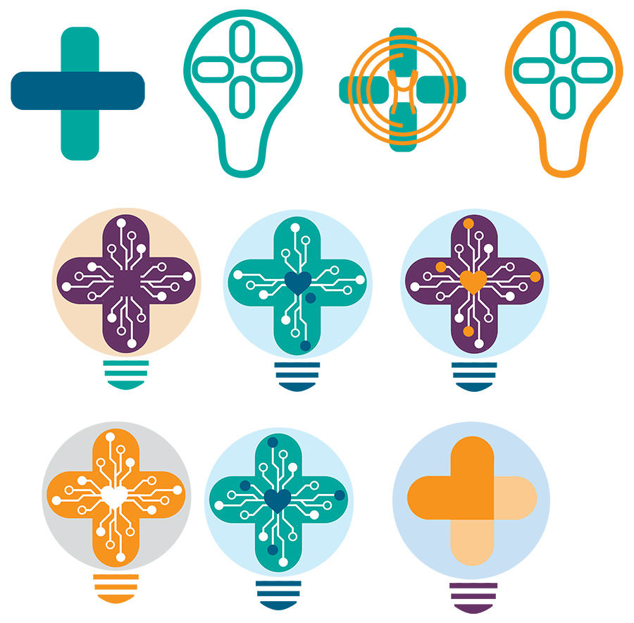
One of the most challenging aspects of this project was designing a logo that was both visually appealing and aligned with the branding guidelines of Fontys and the specific identity of the Health Innovation minor. My initial concept featured several symbols: a light bulb for innovation, a cross for healthcare, and a heart symbolizing passion and life. I also included a dot-and-line motif to represent technology and progress.
My initially design was too complex and lacked clarity when I applied it in the brand guide. Through iterations, I simplified the design, focusing on the most meaningful elements. This process taught me the importance of balancing creativity with usability. The final logo is clean and professional and I think it aligns seamlessly with the minor’s visual identity.
Working independently on this project presented unique challenges. Due to illness, I was unable to participate in group discussions or presentations, which limited opportunities for feedback. However, this experience strengthened my ability to plan, prioritize, and execute tasks independently. It also reinforced my understanding of how a brand identity can drive engagement and communication.
This project allowed me to combine research, creativity, and strategic thinking to develop a cohesive brand identity for the Health Innovation minor. I learned the value of iteration, balancing creativity with practicality, and maintaining consistency across various media. While I’m proud of the final results, I see opportunities for further growth, such as expanding the content strategy with additional formats like video or email campaigns.
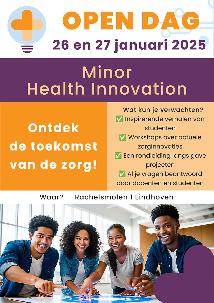
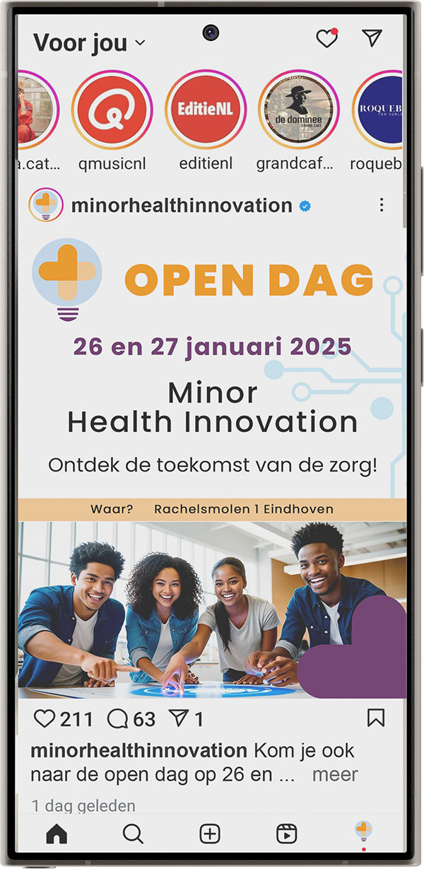
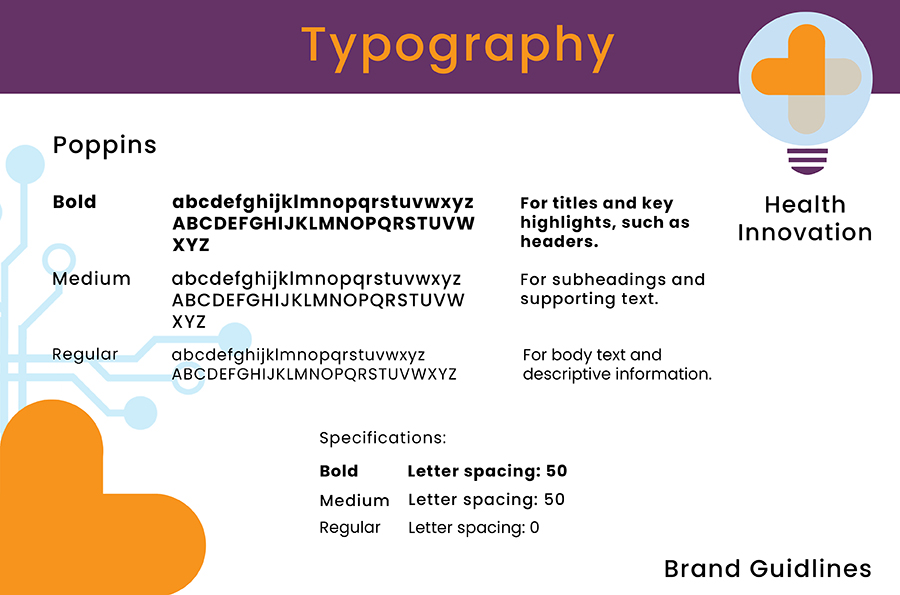
The project began with an analysis of the provided PowerPoint. After that I started with a Exploratory Research. These resources offered insight into the minor’s core values and challenges, such as limited visibility and competition with other programs. They also highlighted Fontys’ overarching house style, which emphasizes consistent typography, colors, and messaging while allowing flexibility for individual programs. To develop the brand identity, I conducted research on color psychology and selected a palette that reflected the minor’s core values. Purple was chosen as the primary color to maintain consistency with Fontys’ identity, while orange was added to evoke energy and innovation. I also selected Poppins as the primary typeface for its modern and approachable design, which complemented the innovative character of the minor. The logo design process involved several iterations. My initial concept was refined to ensure the design was clear and adaptable across various media. Once the logo was finalized, I created the style guide and brand guide, detailing the use of typography, colors, and other elements to maintain consistency. Next, I applied the branding to a poster and an Instagram post, focusing on visual appeal and clarity. The poster highlighted key event details (Open Day) while incorporating dynamic layouts and imagery that reflected the minor’s values. The Instagram post complemented the poster, maintaining the same visual style to ensure consistency across platforms. During the process, I revised the brand guide based on practical insights. For example, I refined the typography section to ensure clear guidelines for using different font weights and spacing.
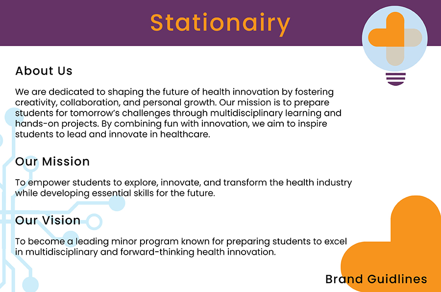
To translate these values into a visual language, I developed a stylescape. This visual board combines colors, fonts, imagery, and design elements to explore different styles that reflected the minor’s essence. Once a clear vision was established, I used these stylescapes to develop a brandguide. The brand guide outlined the visual identity of the minor, including its color palette, typography, and design elements. It was the starting point for ensuring a consistent and recognizable look that can be used for all future communications.

The analysis of the minor’s website and PowerPoint was crucial in understanding its identity and challenges. The minor’s core values—innovation, teamwork, personal growth, preparation for the future, and fun—formed the foundation of the branding. Fontys’ house style provided additional structure for the design. Its key elements include:
For the use of style, I noticed the following:
Fontys uses a unified clear visual identity/house style for all programs/study areas. The style emphasizes consistency in color, typography and messaging, The individual programs are given some flexibility to reflect their unique characteristics. (e.g. Fontys Academy of Arts, Fontys ICT InnovationLab.
The key elements of the Fontys house style are:
• Typography: use of fonts: Roboto and Arial
• Colors: Purple, white and supporting color: blue.
• Images: Photography often focuses on students actively engaged in their learning environment, emphasizing collaboration and practical application.
For the poster and Instagram post, I focused on creating visually engaging designs that communicated essential details. The poster prominently displayed the Open Day event and its date, ensuring prospective students knew when to attend. The use of a dynamic photo captured the minor’s core values, which were mentioned in the briefing of this branding project: fun, innovation, and preparation for the future, making it relatable and appealing to students.