In this project, we developed a media campaign for the band Nasmak. The goal was to align the campaign with the band's identity and target audience. This involved researching the audience, creating engaging concepts, and designing interactive elements such as competitions or events to support the campaign. The focus was not just on awareness or promotion but also on fostering deeper audience engagement.
This project has been a valuable learning experience for me, especially as it involved both creativity and strategic thinking. By analyzing the band's mission and vision, I developed marketing materials, such as merchandise ideas, that aligned with their unique identity. While I did face some challenges due to being absent several times because of illness, which made collaboration and communication a bit more difficult, I am really satisfied with the outcome of the project. Despite these challenges, I was able to contribute, and the final result was successful. I also had the chance to present our ideas, and the presentation went really well. It was great to see how the branding ideas we worked on were received and how I was able to communicate them clearly and confidently. This project helped me develop both my creative and communication skills. I learned the importance of creating a brand that speaks to its target audience while staying true to the band's unique style. Going forward, I want to continue improving my skills in branding and presenting ideas, as well as developing more advanced strategies for digital content.
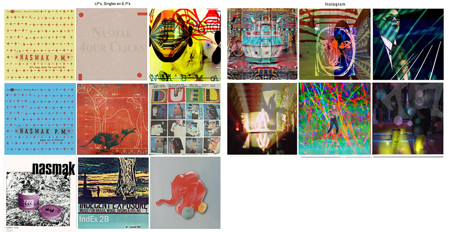
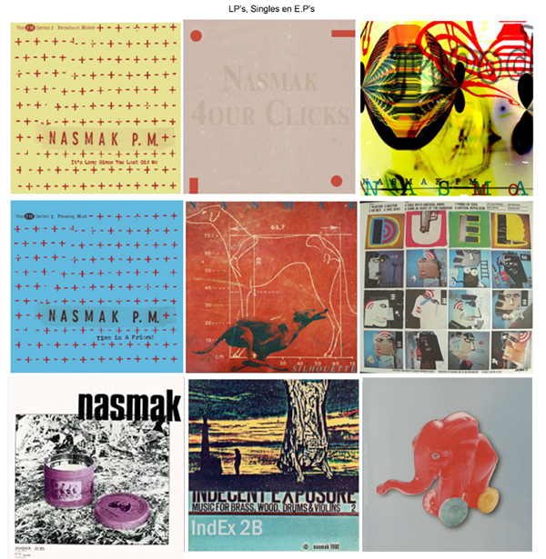
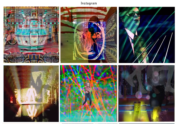
To begin with, I visually represented Nasmak's identity. I started by checking out Nasmak's website, YouTube, and Instagram to understand their style and to see what kind of vibe they give off. Nasmak’s website and album designs show a bold and surrealistic approach that aligns with their music and lyrics. The titles and branding of their albums and tracks often have a surreal touch, which provides curiosity and interest. The YouTube videos gave me a energetic vibe, which I want to use to add movement to the visuals. On Instagram, I also saw a lot of unique surrealistic images and videos videos that showed more of their unique style.
From an interview with the band, we gathered key themes that define their identity: escape from reality, rebirth, change, vibrancy, and energy. These themes closely align with the visual and emotional impact of their music. Nasmak aims to provide their audience with an escape from the ordinary, and their identity thrives on constant evolution and bold expression.
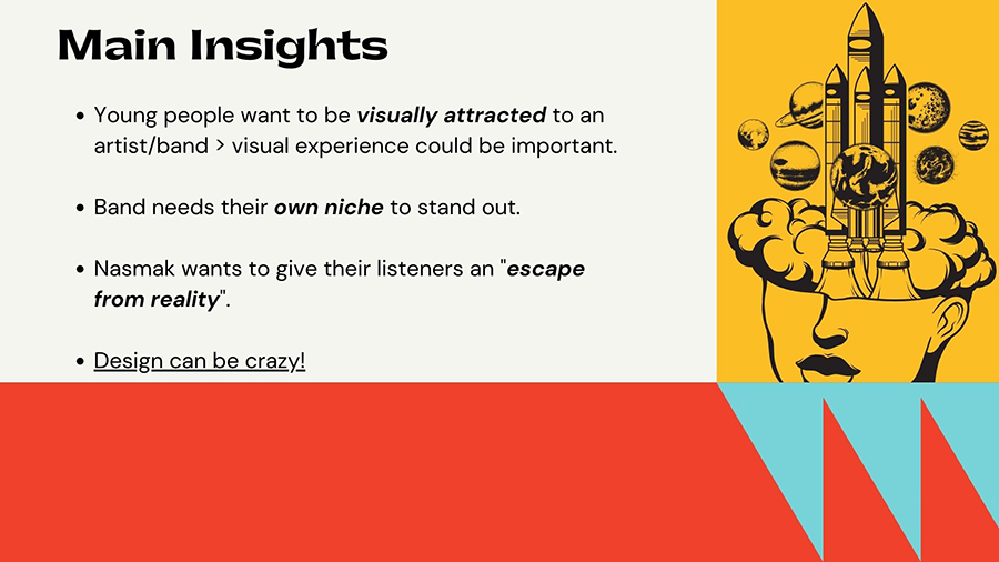
The main insights I gained from my research and the interview include:
1. The visual experience is important.
2. The band needs their own niche to stand out.
3. Nasmak wants to give their listeners an escape from reality.
4. Designs can be crazy.
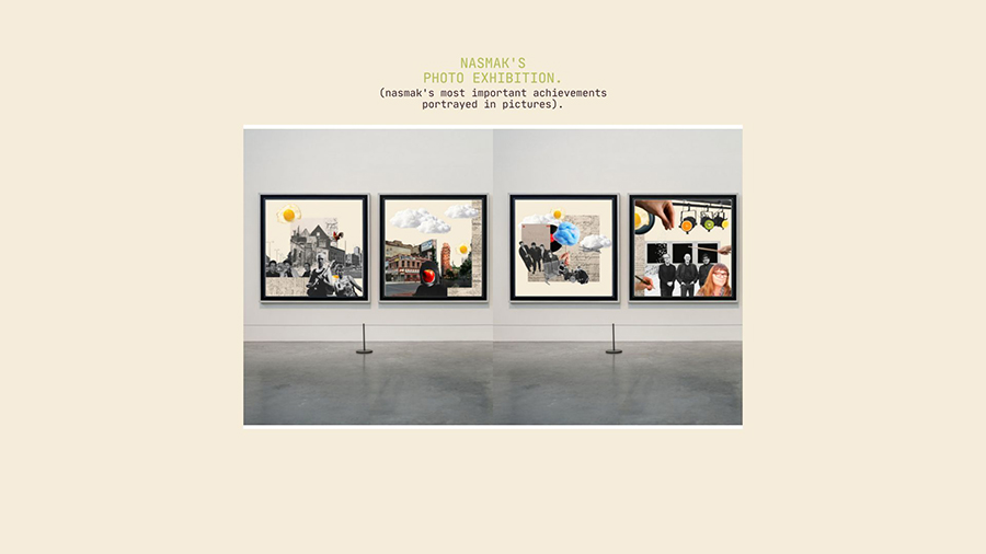
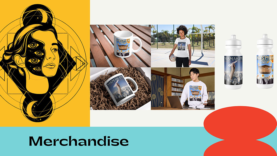
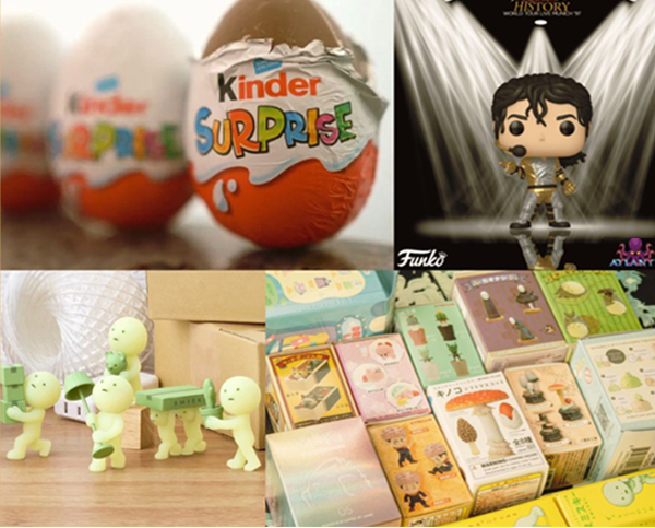
With the group we had the idea to (also) design collectibles with limited runs. A kind of big chocolate ‘Surprise’ egg with an element of taste referring to the name Nasmak. We want to make collectibles based on album, song or concert.
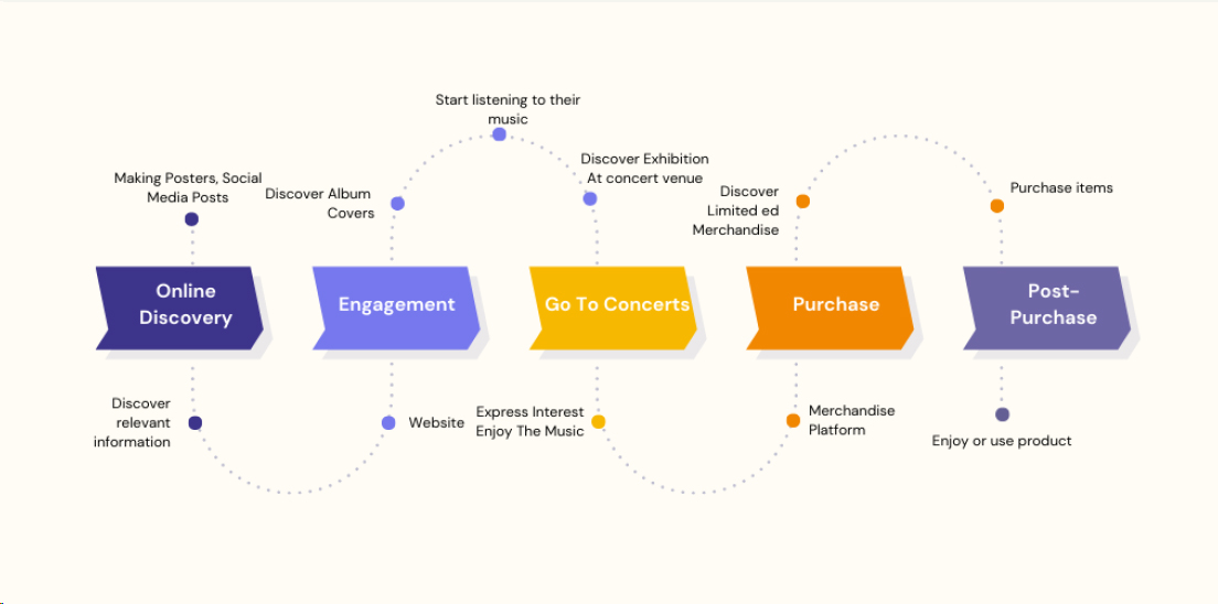
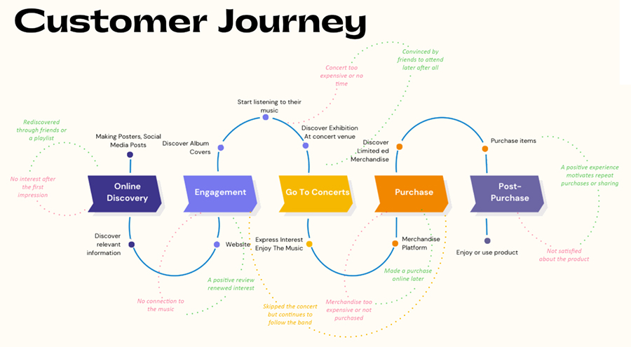
For our initial presentation, we visualized a customer journey in a diagram. This journey represented the path we believe potential Nasmak fans might follow. After our presentation, we received feedback that the customer journey was too idealized. In our diagram, everyone follows the same path, and no one drops off. I’ve created a new customer journey that reflects a more realistic scenario, showing how people can deviate from the path, drop off, or return, along with reasons why this might happen.
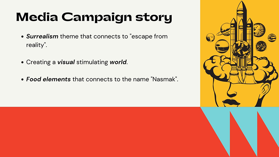
I started to visualize Nasmak's identity. I did that by making a moodboard. With this moodboard I tried to show what kind of band Nasmak is. When I look at the moodboard, I think I managed to visualize the Surrealism theme that connects to "escape from reality". I found it important to use food elements in the moodboard: This connects to the name Nasmak. After the moodboard I created a stylescape. In the stylescape you see different fonts. I choose for multiple fonts and to not stick to one because Nasmak has an interesting sound which is dynamic and always chancing, dynamic, experimental and unpredictable.
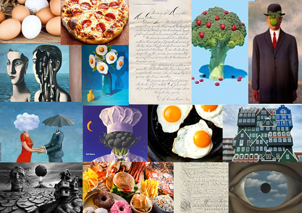

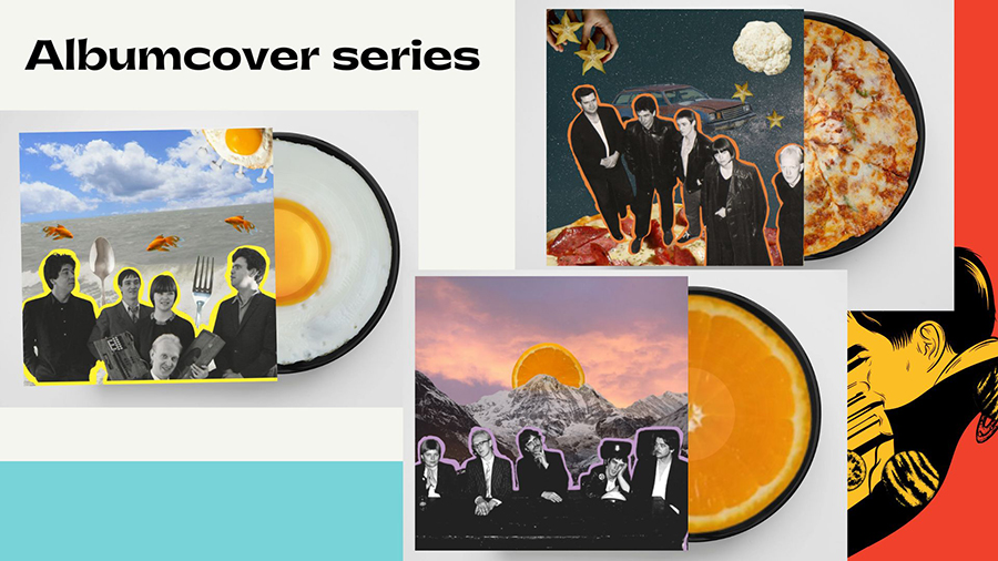
When designing the visual identity for Nasmak, the goal was to choose elements that reinforce both the band's musical style and message. The band wants to offer their audience an escape from reality, and incorporating surreal imagery reinforces this message. The visualization of food in the design fits this, as it ties in with the name “Nasmak” and adds another layer of meaning. I felt it was important to choose the visual elements carefully so that they not only represent the band itself, but that the audience also recognizes the band in this.
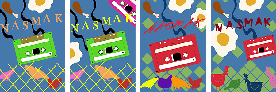
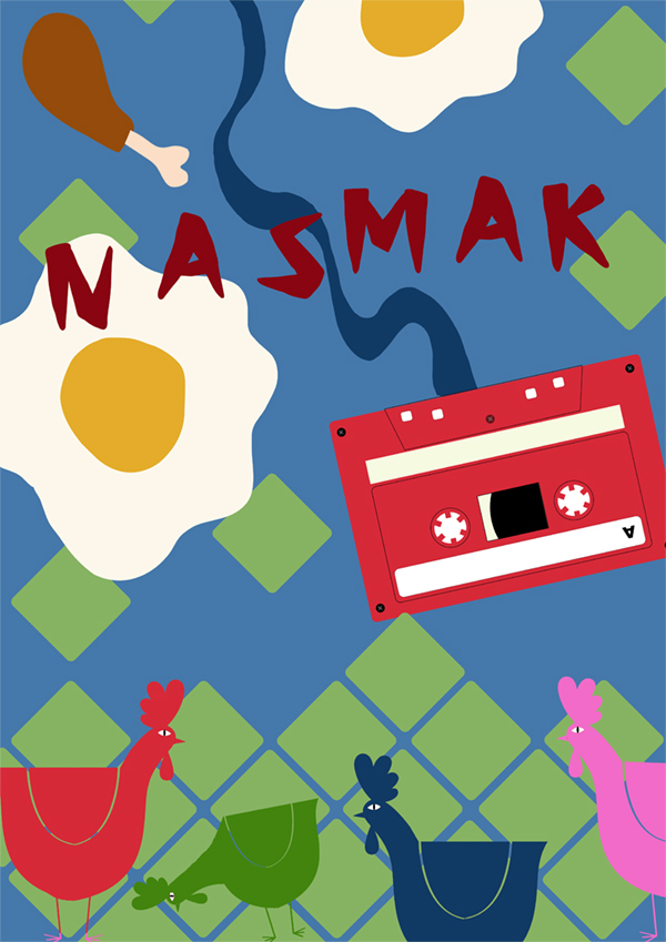
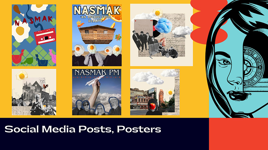
In the poster The squares at the bottom of the poster, which stand on a point and gradually disappear, represent chicken wire. This symbolizes the period when Nasmak began rehearsing in a “chicken coop” - a humble beginning far removed from the band's current, more professional status. The slowly disappearing squares emphasize that the band has grown out of the chicken coop and no longer rehearses in that spot. Additionally, the use of baked eggs in the design is a clear reference to the name Nasmak, which can be associated with food. It links to the chicken coop theme and adds to the surrealistic atmosphere of the poster. The cassette tape in the design refers to the time when Nasmak still recorded everything on tape, connecting them to their early years and to the authenticity of their music production at that time.
The final design is the result of several iterations. Initially, I experimented with literal depictions of chickens and wire, but these were too realistic and didn’t match the surrealistic tone I wanted to convey. I adjusted these elements and further refined the design by playing with colors and typography. This process helped me create a cohesive poster that effectively tells the band's story: How they have grown from humble beginnings into something much bigger, without losing their experimental and surreal style.